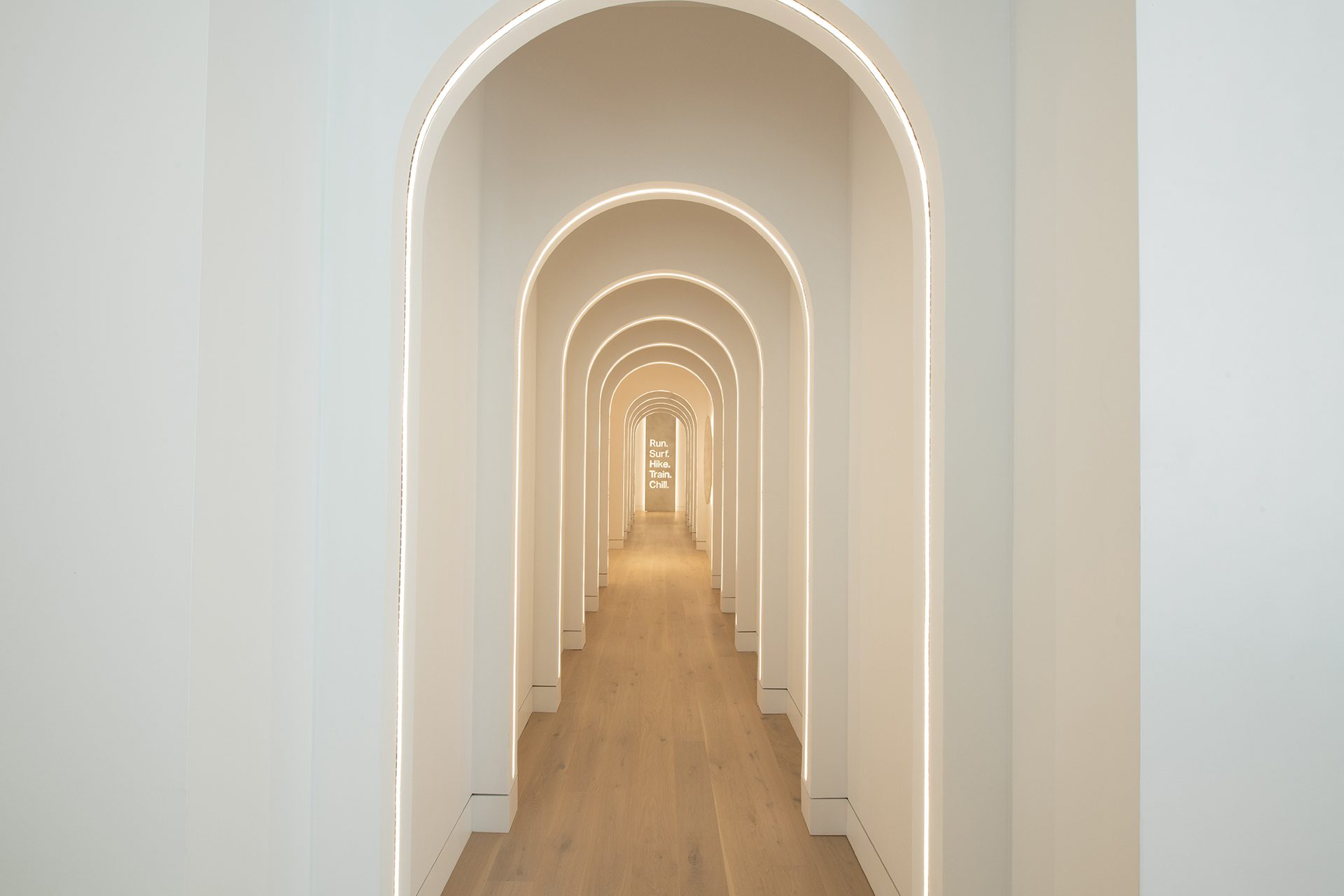
When you're creating a new space, the brand and feel of the space are the primary drivers behind design decisions. Typically, lighting plays a big role in setting the mood when you walk into a room. Specifically, the light color — even slight variations of color — can greatly impact the vibes of a space. You've spend countless hours creating a unique vision for a property, and lighting can enhance and highlight your architectural design.
Most often, when you're talking about light color, you want to pay attention to the correlated color temperature (CCT). It's a gauge of how warm or cool the color of light emitted from the source appears. As a reference point, the CCT of sunlight is approximately 5780K while the CCT of a flame is around 1600K. Lamps can typically come in all color temperatures, and to complicate matters, different products and manufacturers may also have slight color variations that can cause an inconsistent look.
There are other specifications that are important when it comes to color quality. Color Rendering Index (CRI) generally indicates how the light from a lamp will affect the colors of the environment around it. But there are more examples, like R9 color rendering value, which gauges how vibrant red colors will look in a space. For the purposes of this article, we'll focus in on the perceived color or tone of the light.
The bottom line: light color can be complicated, but having an understanding of which CCT is most appropriate for the space is a good starting point for any project. Once you have an idea of the brand and goals of a space, a lighting designer can help ensure that the lighting enhances your vision for the space.
Guide to CCT for architects by industry
Warm and welcoming or sharp and to the point? The CCT correlates directly to the look and atmosphere of a space. To set the table for a quality guest experience, consider the CCT guidelines below.

|
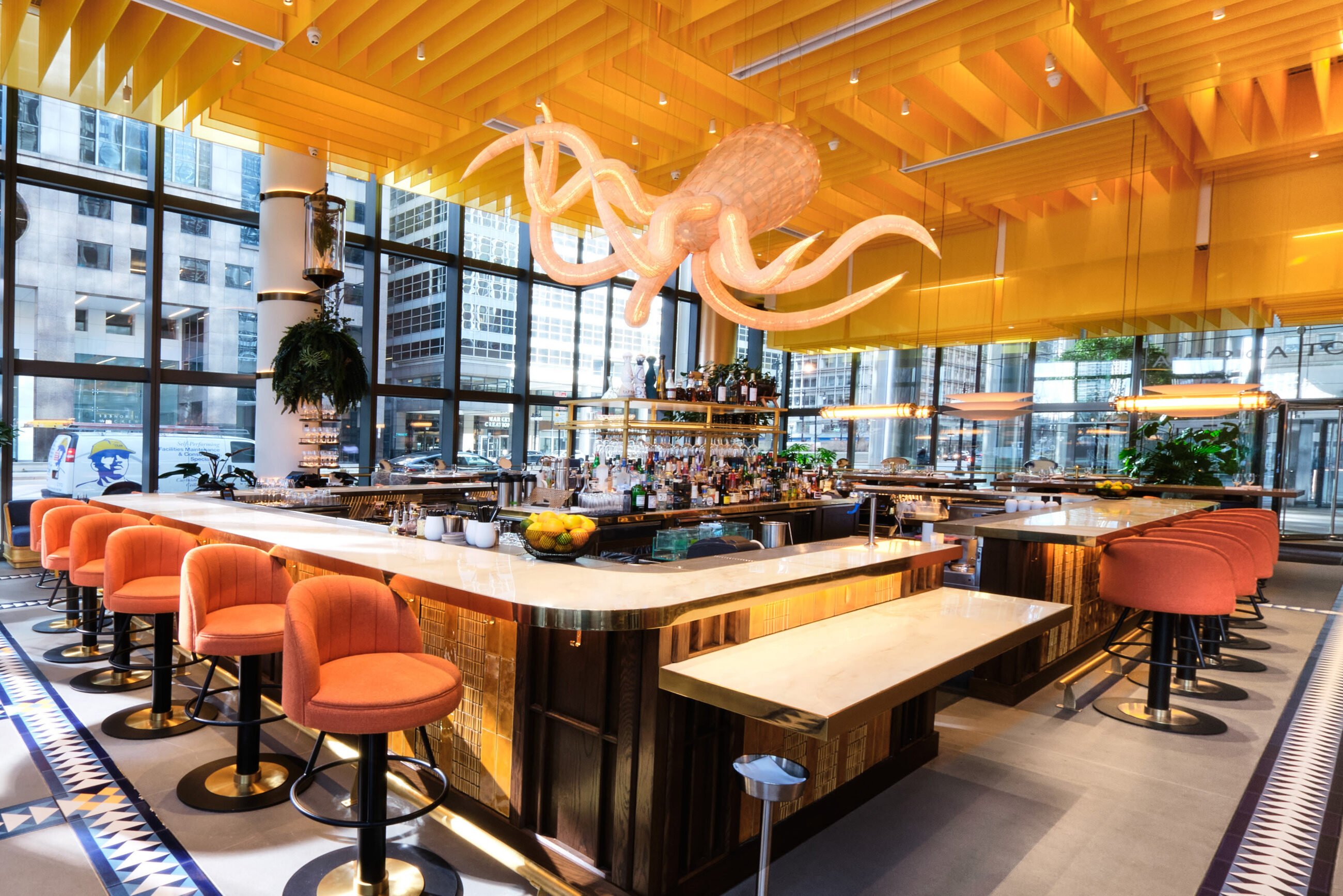
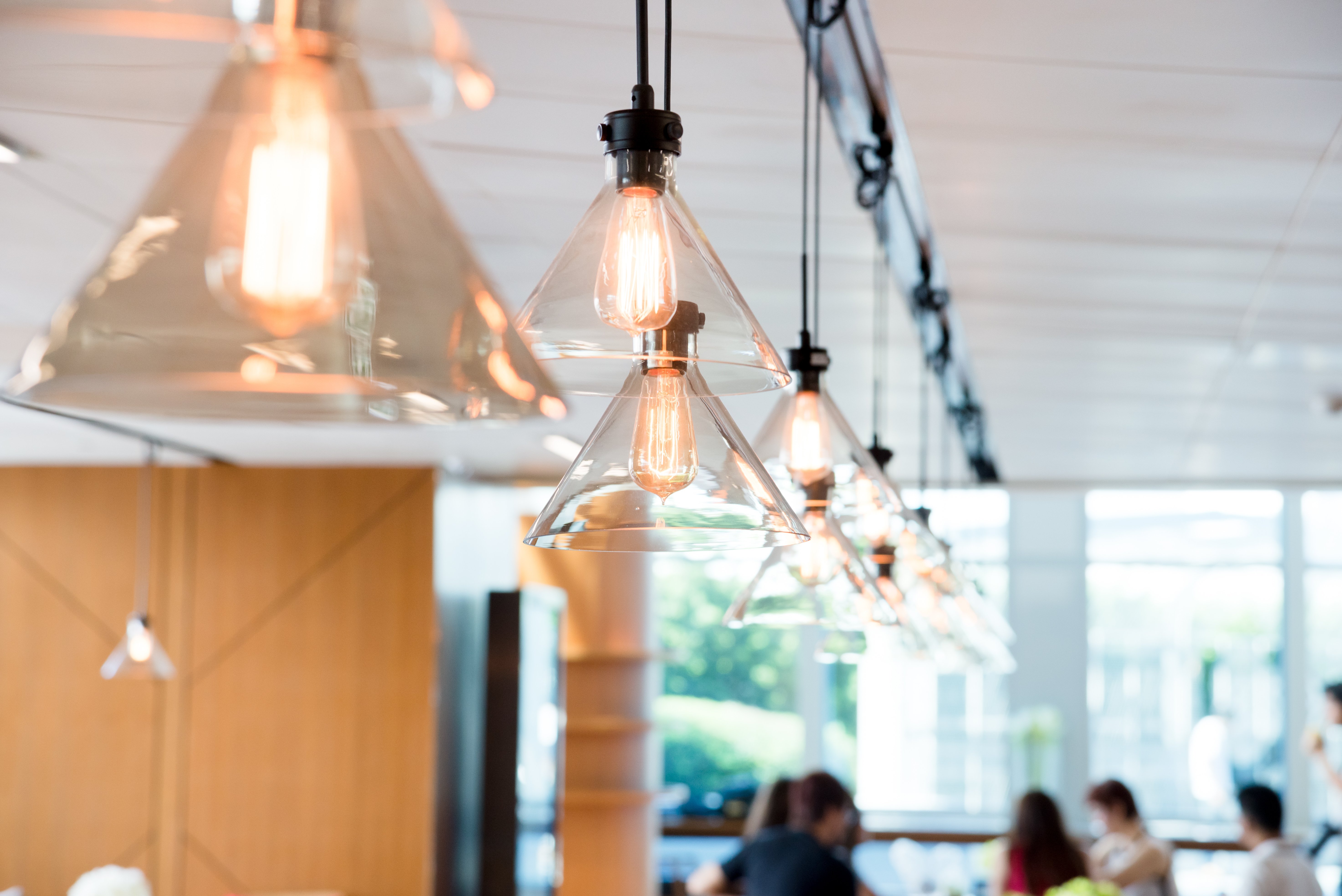
HOTELS Hotels feel like a "home away from home," often with a little bit more glamour and luxuriousness than guests have at home. At the same time, hotels like to differentiate their brands with a specific tone and environment. Warmer color temperatures throughout the lobby, hallways, and guest rooms are common option, but some hotel brands lean toward cooler light. The brand should take top priority as you consider light color in hotels. (Design tip: First impressions are important, so consider statement light fixtures that can really 'wow' guests in the hotel lobby.) |
|
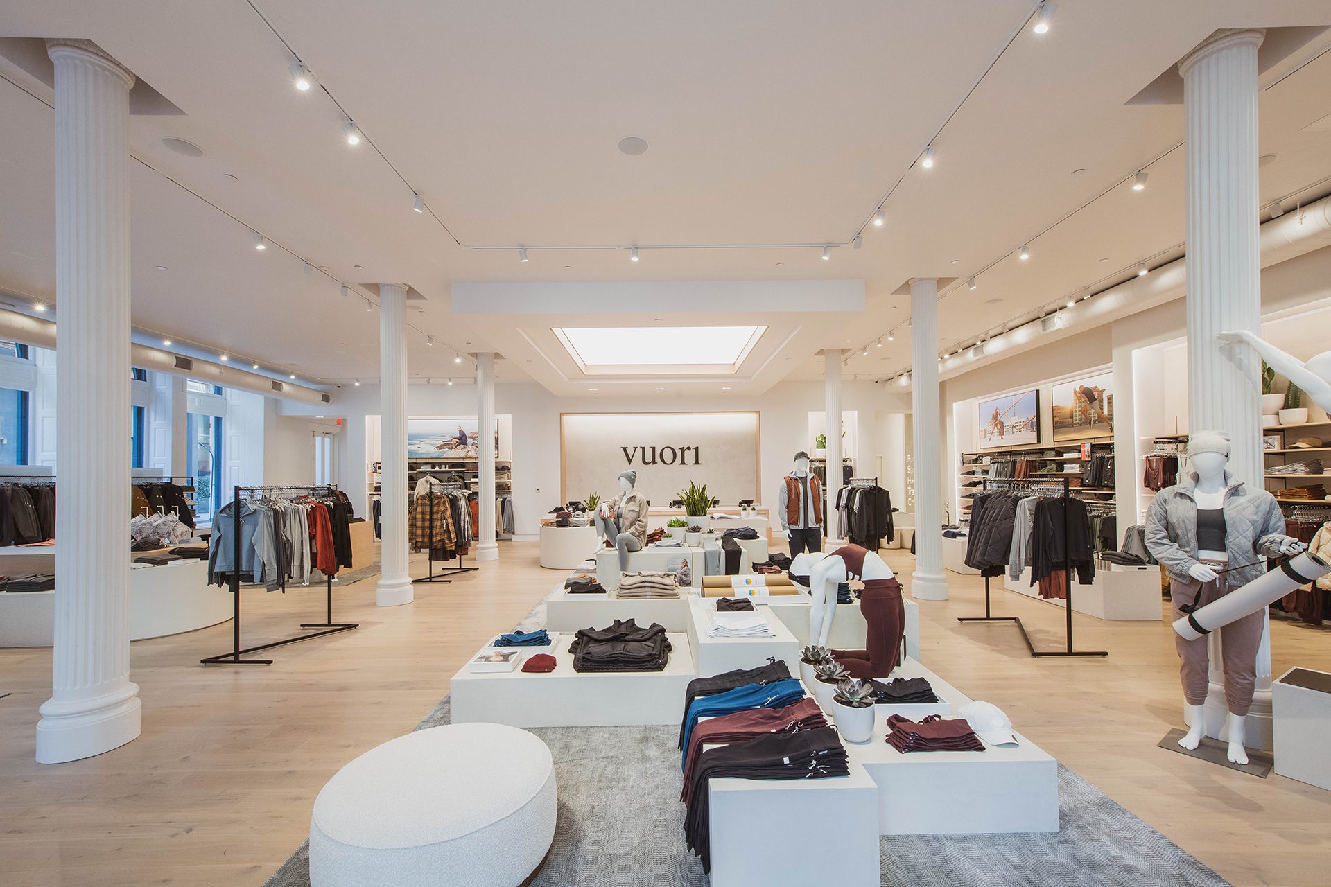
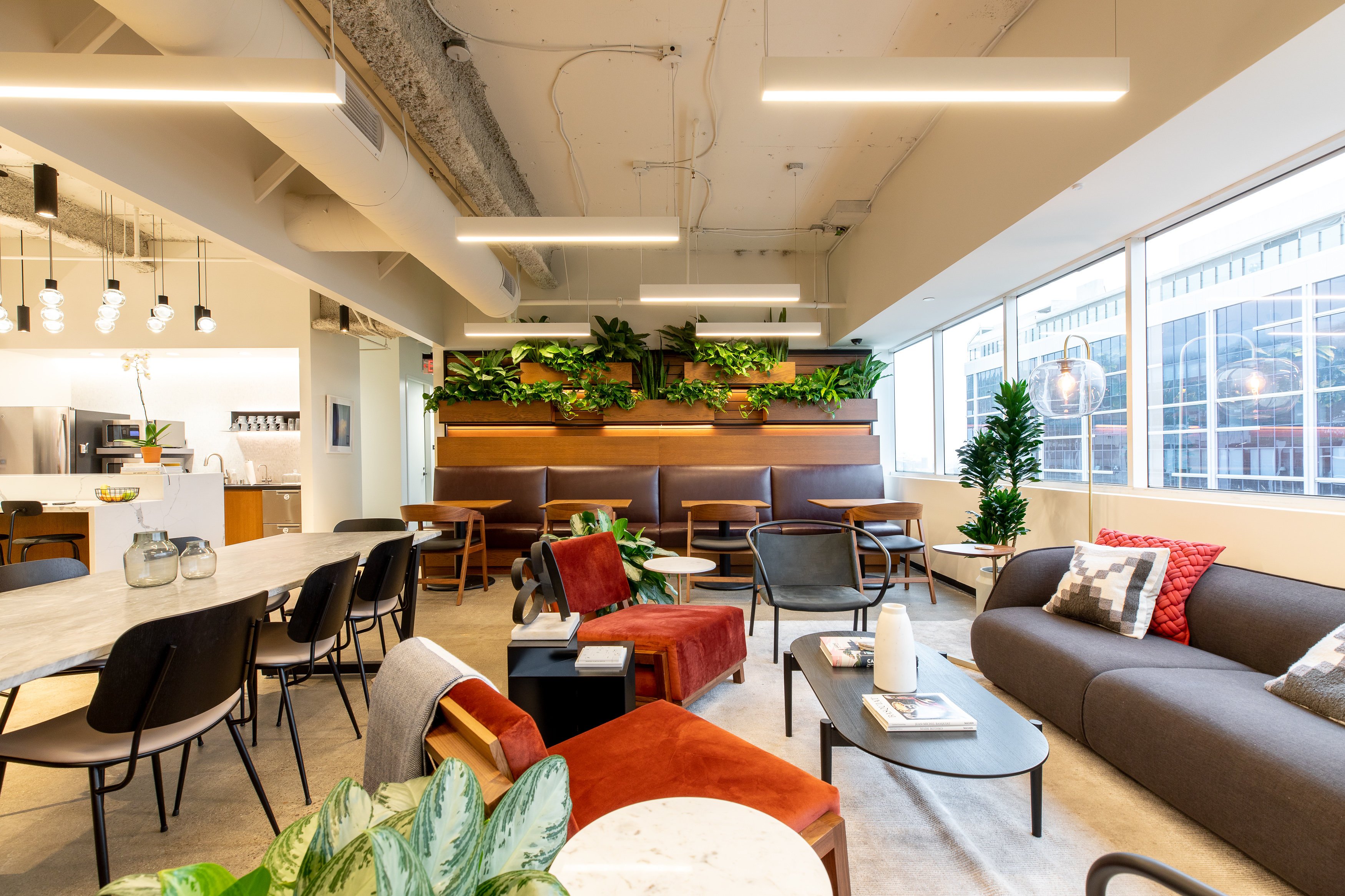
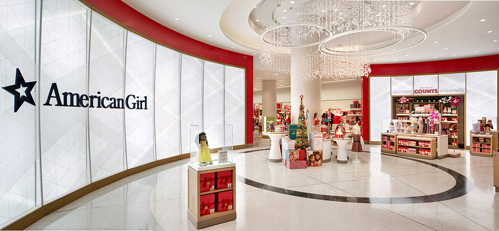
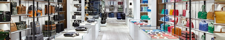
RETAIL Choosing the right color temperature for retail typically varies based on the brand, atmosphere, products being sold, and even location. With that said, most retailers in the US choose lighting within the 2700K to 4000K range. Some also choose to mix color temperatures. As examples, a home goods or furnishings retailer will often lean towards a warmer color temperature at 2700k or 3000k (think cozy and warm at home), and a retailer selling something like jeans may veer towards a cooler color of 3500k to help the blue in the jeans pop. |
|
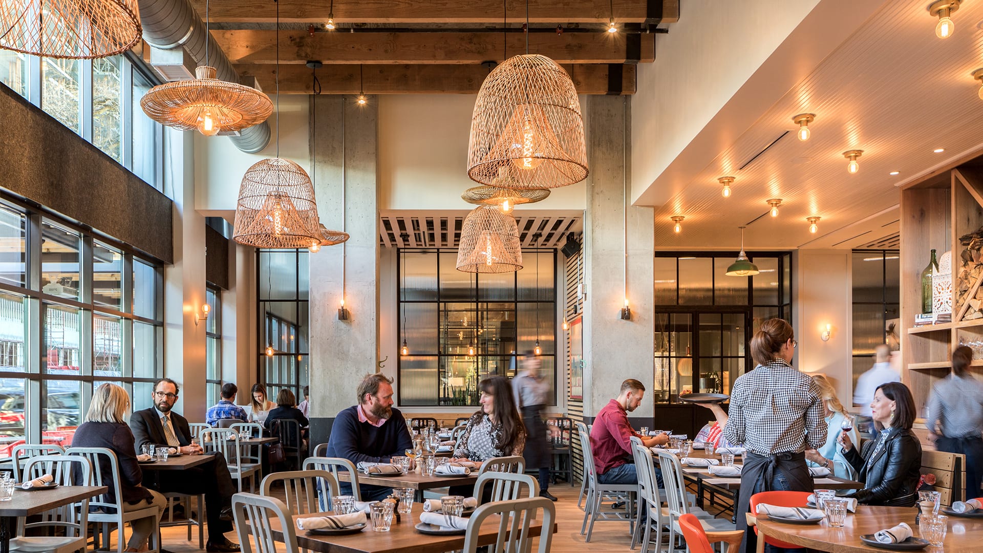
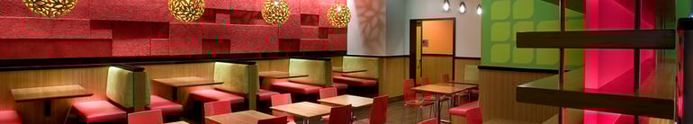
RESTAURANTS Dining is another application where brand is important, but we tend to see some clearer guidelines. High-end restaurants (like a steak house) tend to lean toward warmer lighting that is welcoming and helps guests relax. Fast casual tends to have a range of light colors that are largely brand-driven. Many fast food concepts opt for neutral to cool colors as they focus on an environment that feels clean, organized, and fast. |

|
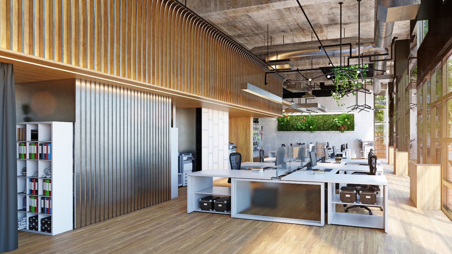
COMMERCIAL OFFICE Commercial office spaces tend to fall into the category of "sharp and to the point." Neutral to cool color temperatures are generally best in office spaces to promote an atmosphere where workers can concentrate with few distractions. In some shared areas or co-working spaces, warmer color temperatures may communicate a more inviting atmosphere. |
|
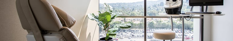
HEALTHCARE Cooler color temperatures are ideal for setting a clean, crisp atmosphere and creating alertness in a hospital or other healthcare facilities. |
|
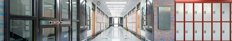
SCHOOLS & UNIVERSITIES The CCT for schools and universities often varies by area. For common areas and classrooms, setting an energetic atmosphere that promotes alertness is important. Cooler color temperatures will get the job done. For other areas, like dining rooms, warmer color temperature tend to work well. The focus here is on the purpose of the space and the brand of the organization. |

|
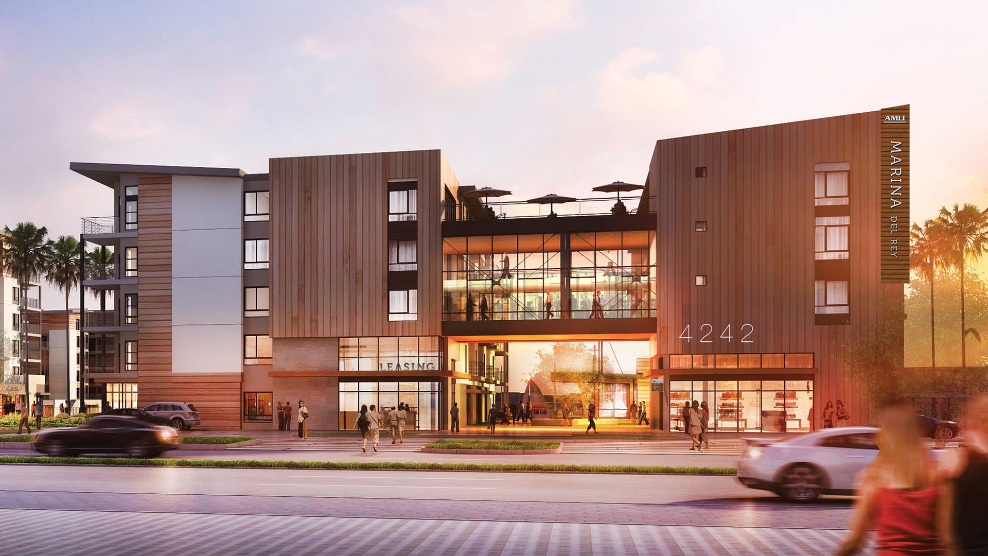
MULTI-FAMILY Multi-family properties need to attract tenants to their new home. This combination of new and fresh branding with the allure of home creates a unique opportunity for lighting. Both warm and cool color temperatures can be successful for these properties, depending primarily on the brand. You'll also want to keep in mind attractive exterior lighting to complement your architectural work and draw tenants to the property. |

Tips for selecting the right color temperature (and specification)
While LEDs have contributed greatly to new lighting technology and flexibility with color, there are a few considerations to keep in mind when selecting the right product to use in a space.
1. Consider your space
This is what we consider the "golden rule." Just because a certain color temperature works for one restaurant doesn't mean it will work for another restaurant. Our recommendations will differ based on your space and the ultimate design goals. Our lighting design team always keeps in mind that products can be as unique as the space. One LED may do a good job of rendering in the red spectrum and would look great lighting a deep cherry wood. This same product, however, may do a terrible job of lighting blue jeans in a retail shop.
2. Be specific about your priorities
Your lighting priorities will determine the path to choosing the right products. Here are some questions to consider:
- What factors are most important to the client: Brand experience? Long-term energy and maintenance cost? Upfront budget?
- What is the intended use for the space? Do guests or tenants want to spend periods of time in the space or move quickly and efficiently through the space?
- What is the client's budget?
- How often will the use of space change?
- How would you communicate the intended brand of the establishment?
While these questions may not relate directly to lighting color choices, they will help you communicate the brand and the desires of the owner, and that clarity will help direct color and product choices.
3. Partner with manufacturers up-to-date on the latest lighting technology
Thanks to development in technology, there have been game-changing products that help with color hues. If you partner with manufacturers whose products incorporate the latest lighting technology, chances are you'll have solid options for color temperature.
Those game changers include color selectable or color tunable lighting. Color selectable fixtures offer flexibility in the field by allowing you to choose the exact color temperature once the fixture is in your space. Color tunable lighting allows you to dial in on the exact color of white, helping with manufacturer variations or color shifts over time. Both of these innovations have their place, but these can also be a nightmare when it comes to installation and commissioning. We only recommend these options in specific applications where a lighting designer is walking through the project and assisting with commissioning.
4. Ask about lead times up-front
Lead times are more important than ever with global supply chain issues. Products also have more variables, like color consistency and more CCT options. As a result, it's critical to ask about lead times up front. You don't want to find the perfect product only to realize it has a lead time that will jeopardize your project schedule.
Color temperature and color consistency
Color consistency problems tend to arise with manufacturers who don't have a tight policy on the chips they use in their products. In some cases, there may be a noticeable different in visible color from one fixture to another. Other times, the product can slowly shift to blue, green, or pink hues over time. Unfortunately, this can make a space you designed look great on day one but gradually look like it's not well maintained.
While technology like color tuning and color selectable fixtures help solve for color consistency problems, the paramount factor on color consistency is having lighting partners who provide the right level of quality for the budget and will stand by their product. The last thing you need is a lighting issue that detracts from the architectural details you worked so hard to incorporate.
There's no substitute for working with the right lighting design team on a project. Our team is here to make sure that your lighting (color, quality, lead time, and design) truly compliments your work and enhances your client's brand. Contact us for a consultation.